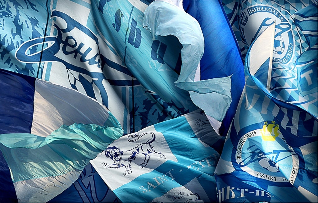
Club logo
First straight, then quickly down, at an angle. That`s the way it was drawn on school desks, taking on three colors. What does the Zenit arrow look like? Like a greeting to those who are in the know, like an oath of honor. The heart of St. Petersburg beats inside the Zenit arrow!
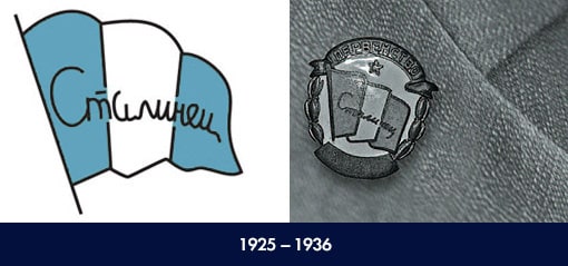
The flag of the voluntary sport organization “Stalinets” can be considered to have been the team emblem until 1940. There are two variants of the flag colors: the vertical lines could be either a sky blue color, or an “electric” color. That said several historical sources suggest that in reality there were all shades of blue and green on the team flag, and the only clear rule is that the far outside stripes had to be of the same color and the Stalinets name had to be written clearly.
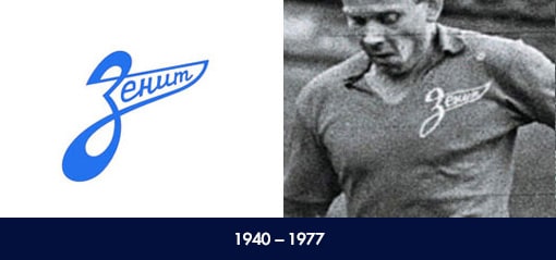
The word Zenit (in white, blue, or red, traditionally symbolizing belief, hope and love) was written in a wave-like arrow (with a raised or lowered end), formed from the upper and lower round parts of the letter “Z”. The sizes varied – the team played with a logo which covered almost a quarter of the logo, as well as with an emblem more common in size for our days.
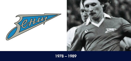
The word Zenit (blue or white color) was written inside the arrow with straight thunder rays. The letter “Z” fit inside the open end of the arrow, while the letter “T” fit into the tip of the arrow.

By the end of the 1980s the changes going on inside Russia had an influence on the football club as well. The team logo was made more modern, with a ball being added to the arrow. One of the most famous symbols of the city on the Neva was added to the top of the circle: the gold ship of the Admiralty.
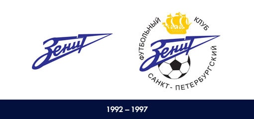
After the change in the city name from Leningrad to St. Petersburg the corresponding changes were made in the team`s logo. However, on the field the blue-white-sky blues started to play in uniforms without additional decorations – the historical period demanded that Zenit work on its play rather than on its emblem.
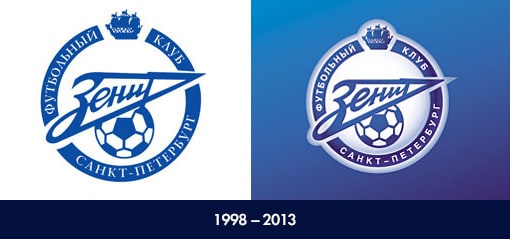
When Zenit returned to the highest Russian league in 1996, the club brought order to its official documents as well: now the Blue-White-Sky Blues took the field in kits with the official club emblem – an arrow, a ball, and the golden ship of the Admiralty, with the words Saint-Petersburg Football Team written in a circle around the emblem. It was was this logo that Zenit became famous in Europe, winning three Russian national titles, as well as the UEFA Cup and UEFA Super Cup. The logo underwent some minor changes in 2008, with greater volume being added as well a a new font.
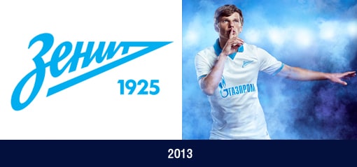
Zenit`s current logo was presented on July 11, 2013 at the Leningrad Metal Plant, right where the club`s history began. The new logo was designed by the Wolff Ollins agency and one of Russia`s top font specialists – Ilya Ruderman.
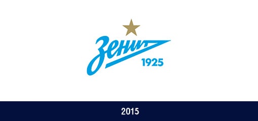
After winning the title for the fifth time in the club's history, the Blue-White-Sky Blues earned the right to place a star along with their emblem, from May 17th onwards! .